Earlier this month, I got to attend the first-ever Layers conference in San Francisco, running concurrently with Apple’s WWDC and featuring a number of industry stars giving excellent talks in a pleasant and comfortable setting. It was just a block away from the huge crowds at Moscone Center, but it felt a bit like an undiscovered country, and one with a palpable sense of engagement and excitement among its attendees.
In everyone I met and chatted with during my time there, I found a real eagerness to learn and make new things, which only grew as the presenters stoked interest and provoked delight. I came away from the experience with five particular lessons that I want to carry forward in my work at DevelopmentNow.
1) We need to use every app we build with our eyes closed
Laura Savino’s talk took place in the middle of the conference, but it seemed to me as if everything else I saw and heard could draw connections to it. Her gimmick was simple but incredibly effective: she took a room full of people with iPhones, gave them earbuds, and made them use their devices without looking at the screen.
I think of myself as someone who cares about accessibility, but to my own shame, I’d never actually turned on VoiceOver on my own phone. Savinola walked us through enabling accessibility mode, then through using different apps in that paradigm, explaining as she went how people of different abilities might utilize them. Her enthusiasm for Apple’s extensive accessibility support was both real and infectious, and made me see writing code to take advantage of it as an opportunity rather than a chore. I even managed to pass her final exam: taking a selfie with my phone’s screen turned off.

It only took four tries.
I tried out some of the apps we’ve built with VoiceOver enabled, and I was pleased to find that they functioned in a logical and useful way! I also found things we could improve on in just a few minutes of testing. When we build applications, we’re not just making something pretty or cool, not just making colored lights appear on a rectangle. We are organizing information in a way that makes people’s lives easier. When we remember that, it becomes clear that testing our apps for accessibility makes them better for all their users.
2) Do complex things, but present them simply
Getting to see Susan Kare open the conference was a personal and professional highlight. Kare is a legend for her work designing the icons and fonts for the original Macintosh, as well as many images (even the Solitaire cards!) for Windows 3.0. Her talk was part history, part principle, and getting to see how one had borne out the other was fascinating.
The process of icon design that Kare outlined was startlingly ahead of its time—rapid iteration, hunting what she called the essence of the functionality it represented, always ready to discard a draft in favor of a stronger choice. It wouldn’t be until the next millennium that we got the term “agile.”

Obviously, this all applies to creating and developing app features as well as graphic design. The Macintosh Finder could have been a mess of cryptic words, with every feature presented at the same level and at the same time.
But instead, in part through Kare’s work, it became the measured grid of icons that we now see in every operating system—each a simple point of contact for the powerful, complex applications hidden behind them.
Kare also threw in a great reminder to be prepared for users to see your app fail. She created the playful “bomb” icon for certain system alerts when told no one would ever see it, only to have a customer bring in their Macintosh, afraid it was going to explode!
3) Go where X meets Y, but cover your tracks
One more tidbit from Kare’s excellent talk: the familiar “command” icon from the Mac keyboard was actually inspired by a Swedish tourism symbol, itself a representation of a castle seen from above. Yet to most of us, it just reads as an abstraction, a kind of conceptual “and then some” for any key on the keyboard. These disparate ideas, separated from their sources and combined, synthesized something new and useful.
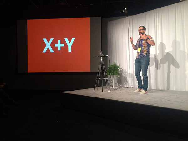
Portland’s own Neven Mrgan made that synthesis the focus of his talk, “X+Y.” By revealing some of his own obscure favorites and tracing their paths of influence to his designs, he demonstrated how our own personal and unusual tastes can be a powerful factor when building something new.
Instead of avoiding the “it’s X meets Y” cliche, Mrgan said, we should embrace it—but put in the work to push that combination from a simple sum into a greater whole. This applies to developing app features as much as design. Look at Vine, for instance, which took the popularity of square cropping from Instagram and resurgence of short, impactful looping video through animated GIFs on Tumblr to build a completely new media platform. Look at the way pull-to-refresh developed from a quirky feature in Tweetie into a core part of iOS, or the way the fling-to-dismiss gesture has quietly crept from Tweetbot into the high-profile apps for Facebook, Tumblr and Twitter. Those pieces of functionality arose from someone’s personal taste—taste for the quick and rhythmic, or the kinetic and tactile—which in turn came from particular works that stuck with them. Finding a transformative influence, and translating it through new media, is how we can work with our clients to drive the field forward.
4) Watch what your users actually do with your app
Of course, the biggest drivers for change in our field have always been end users. Hashtags, which are now inescapable in popular media the world over, started with a suggestion by Twitter user Chris Messina. Flickr famously started as an ephemeral photostream—a concept that would later take hold in Instagram and Snapchat—before realizing that its users were more interested in archiving and tagging their own work. This is the whole concept of pivoting in response to user feedback and data. But it can apply to applications with entrenched user bases as much as services in their infancy.
As seen above, one of the treats at Layers was a sneak preview of some new features coming in Photoshop, presented by designer Brad Ellis. While Photoshop still sees plenty of use by actual photographers, of course, it’s also used to produce graphic design assets at a huge scale—but that space is becoming hotly contested, and trickier as mobile and high-resolution monitors both drive the need for responsive images. To follow the needs of people who have been doing a lot of Save For Web -> Resize -> Save For Web again, Photoshop is integrating artboards and mass export, which will make the conclusion of that workflow much faster and less error-prone.
But that’s not all! Shortly after the conference, Adobe announced Photoshop Design Space, an HTML5 (!) open-source (!) tool for starting an artboard-based project. It wouldn’t have been so long ago that one would have expected Adobe to build a program like this in Flash, or at least Adobe AIR. But by watching their user base and allowing for flexibility, even a venerable software giant like Adobe can shift to build engagement and continue to grow its customer base. The same should be true of enterprise apps and startups alike.
5) You should go to Layers (or something like it)
Layers was a fantastic event: welcoming, thought-through, polished and full of too many great talks to cover here. I have a feeling tickets will go pretty quick at its next instantiation. But more importantly, I got a great deal out of a design conference even though I’m primarily a developer. As Chris Clark mentioned during his panel discussion, at small companies in particular, no one can be just one thing—and keeping up with multiple channels enriches your work no matter what you do.
I came back to work refreshed and energized, with new tools and lenses of perception to address the fundamental challenges of making good software for our clients and our users. The synthesis of ideas that informs all the points above is exactly the reason that all of us with one professional focus should make an effort to look across disciplines for new tools and inspiration, and at Layers, that’s exactly what I found.
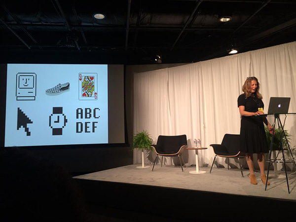
Seen above: a moment from May-Li Khoe’s amazing talk on pushing oneself, staying open, learning, and courage in making new work.