Recently, I was discussing with one of our clients about my thoughts on how best to implement a brand”s voice and personality into a mobile application. This is something that”s very critical to consider when designing an app, for both UI and UX, and you can start to consider it even when you”re at the starting stages, such as the information / content architecture stage.
Allow me to start with some general thoughts on the subject. Firstly, the purpose of your app should come first, with voice and other design choices implemented to help reinforce that purpose. This makes those design and delight decisions become much more noticeable, but keeps them from being distracting.
Secondly, your brand should stay unobtrusive to the function the user is trying to perform. It can reinforce the action the user is going to take or is taking, but it should not block them from performing it.
Finally, the user should be able to understand what the app is going to do without too much, if any, explanation on the app”s part. The user will know the next step in the flow even if they are unfamiliar with the app. Even if we interrupt the user with an onboarding* experience, they will anticipate the end goal of the original flow.
*Onboarding here is being used to refer to a point where we ask the user to Sign Up / Log In before they can proceed.
These thoughts can even be applied outside of app design, but I”ll just be sticking to apps for today. I”ll be referring to two long-existing apps for this post. From that;
Yelp
I like that Yelp makes decisions on how to delight the user that are unobtrusive. If they had decided not to make the decisions they made, it would not bring the app down in terms of user experience. Yelp leads with their content.
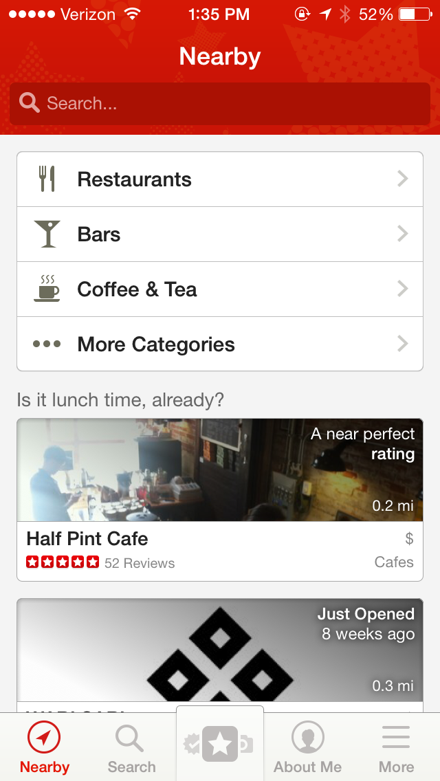
On the Nearby screen, instead of direct headers (“Food”, or “For Lunch”) for each list, the app presents users with casual alternatives that still gives context to what is being shown (“Is it lunch time, already?”) The headers are inconspicuous but supportive; they act as a reinforcement to the content. It is a subtle decision but one that gives the app personality.
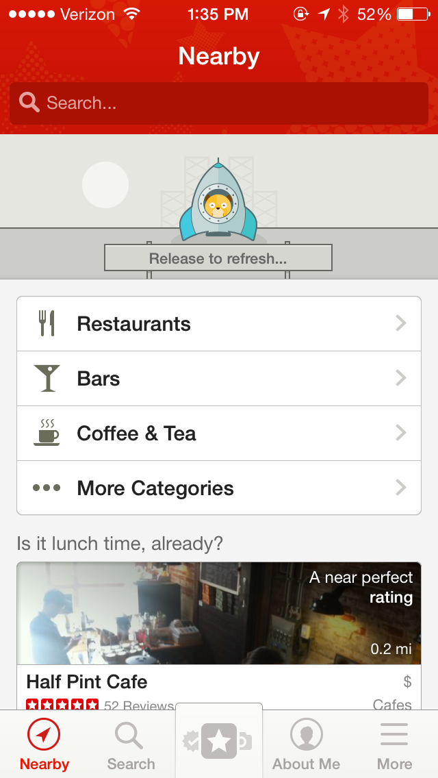
When Yelp wants to show off a design choice, the decision remains unobtrusive and does not stop the user from online casino completing an expected task or function. Take the cute “Hamster getting into a rocket and blasting off” animation that happens when you pull to refresh the content on Nearby. While unique, it”s not a gimmick — it”s still a pull-to-refresh, a function that users have become accustomed to.
Dots
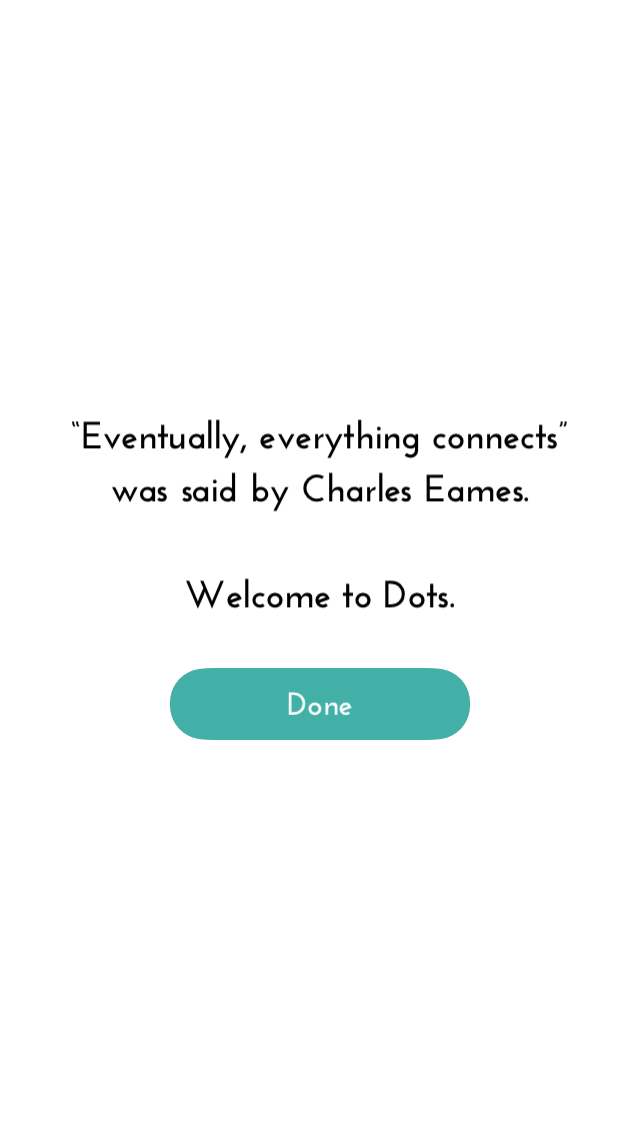
Dots” introductory flow is one of the best I”ve experienced and a great example of how you can simply but quickly perform Inspire/Explain/Connect. The app begins with an author-less quote (“Eventually, everything connects”) that subtly explains the whole game. It”s so short and quick that when you continue on, you get an instant “Oh this is what I do.” You perform the tasks it presents, gives you a pat on the back when you each time you complete it, and you continue on.
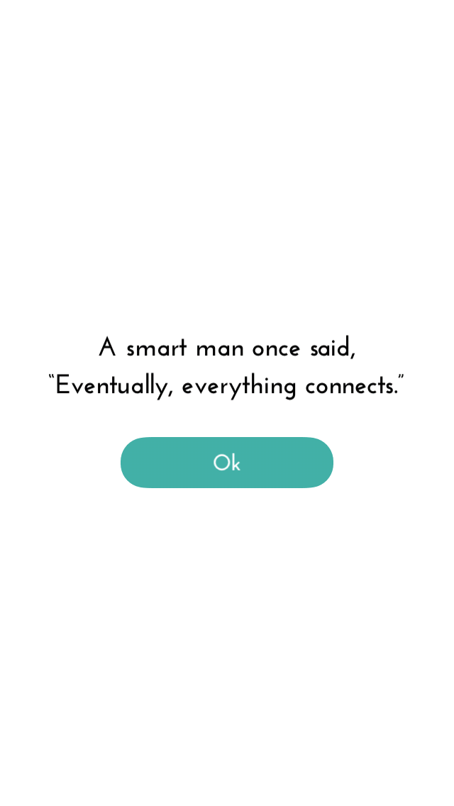
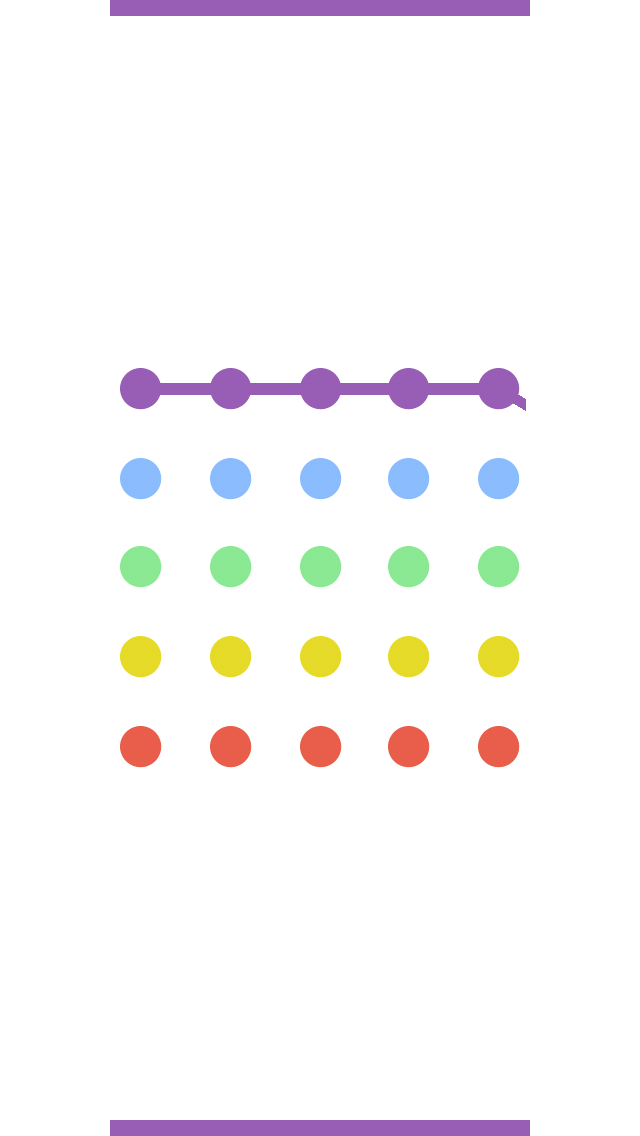
As you go through this experience, the app never TELLS you how things work — it shows you and it makes you do it. The design choices reinforce the actions you”re already making. And once it connects you from point A to point B, it reveals the author of the quote (Charles Eames) and welcomes you to Dots.
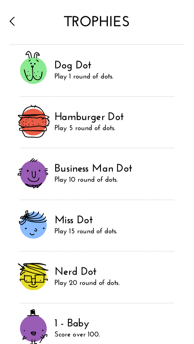
This short experience is powerful in bringing the user into the app, and helps secondary aspects really shine. Dots” trophies, while an additional element, stand on their own in terms of personality, but still fit into the context of the entire app. They don”t take focus away from the game itself.