“We need a display for our booth at TechFestNW”
This was the direction given to the marketing department for what eventually became our prized Project 11. You can read all about the technical wizardry here, but before any lines of code were written or any LED lights were programmed, we traversed through a much more mucky creative process. How do ideas become tangible? What gets us from that vague request to a solid, executable idea?
Brainstorming
Well first, we brainstormed. There are many arguments for and against “brainstorming.” Does getting people in a room together with a whiteboard and post-its promote the free flow of highly creative ideas? Or does it actually stifle them? Will a room full of introverted coders feel comfortable enough to share their ideas in front of the rest of the company, including some creative types (like myself)? Whether it was the the right scientifically-proven way to start this project or not, it’s what we did. We ended up iterating through some pretty mediocre ideas before finally landing on Project 11 – a recreation of Joyce Byers’ (yes, from Stranger Things) living room wall with addressable LED lights. We would build a web app to communicate with the wall so that users could ask questions and see their answers spelled out in lights.
“If you give a good idea to a mediocre team, they will screw it up. If you give a mediocre idea to a brilliant team, they will either fix it or throw it away and come up with something better.” Ed Catmull, Creativity, Inc.
From idea to reality
Okay, we had an idea. Now we just had to build it… in a month. No problem, right? Well, not really. This is where the lessons from the engineers began. When the creative team says “We just need a page where we can have people ask questions and then the lights spell out the answer;” the devs were ready to fire back –
“Is this a native app or a mobile web app?”
“How will we distinguish between users?”
“Can people ask more than one question at a time?”
“What do you want to happen after their question is answered?”
“What does the app look like?”
“What does the display look like?”
“How big is it?”
“How many lights do we need?” … and so many more.
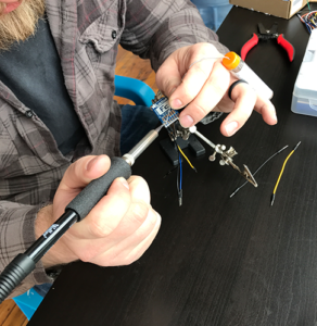
In lieu of sharing our entire JIRA backlog, just trust me that this “simple” project was way more complicated than one would have imagined. That said, it was pretty incredible to see the team start sifting through the tasks and determining who had what expertise and could apply that to certain aspects of the project, and start getting s%*& done.
Execution
While the devs tackled hardware and software questions, the marketing team tackled the functionality as well as the creative design. Do not be mistaken – design doesn’t just mean arts and crafts. Some serious math (eww) went into ensuring that this thing turned out looking they way we wanted it to. First, we had to make that decision.
What did we want this to look like?
When we found some awesomely gaudy wallpaper at Home Depot and some cheeky LED lights that look like Christmas lights, we knew we were headed in the right direction. We then had some inspiration for the app design.
How big was it going to be?
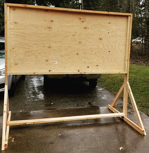
It had to fit in a 10’x10’ booth for TechFestNW. We couldn’t take up the entire 10 feet, but we did want it to be large enough that it could be seen from across the room. What’s a standard piece of plywood? 8’ x 4’ (I learned that from this project!) and that was the perfect size for this display.
How many lights do we need?
To answer this question, we had to get “mathy” (a new term we coined during this project). Each strand of lights had 50 bulbs, at 4.5 inches apart. To maximize space on our 8 x 4’ plywood, what would it look like if we used every other light? 9” apart. Perfect. Except now that meant we couldn’t get by with just one strand of lights. We needed two. Queue another Amazon order.
What did we want the letters to look like?
How large could they be while still fitting under their respective light? What happens if we add numbers too? We ended up mapping that out on another scaled drawing and I got to have a fun painting project.
The Home Stretch Hackathon
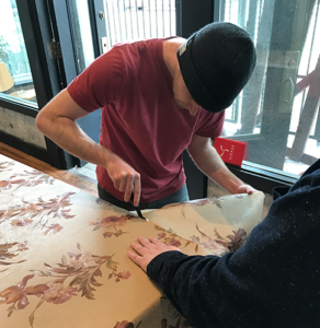
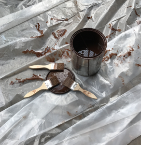
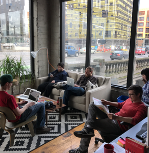
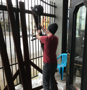
With the backend built, the front end designed, and bugs being fixed as we found them, the last thing we needed was to actually build the wall. An analog hackathon was in order. We got the team together on a Saturday to do the manual labor: priming, staining, wallpapering, drilling, painting. Nothing says “Relaxing Saturday” like power tools and wallpaper paste.
Turning it all upside down
More bugs, more fixes, more upgrades. In a month we went from building a minimum-viable product to making some major upgrades to this project. Most impressive of which is the AI chatbot. Instead of a set of random pre-defined questions and answers, our wall, “William”, was intelligent. We made a full-fledged app complete with a robust hardware component to round out the total interactive experience. We’ll be unveiling Project 11 at TechfestNW March 23rd and 24th at the Portland Art Museum. And we’re already working on some upgrades for V2, including Voice UX, that we’ll be showing off at our Design Week Portland open house.


